

Cincinnati.oh.gov was a large city website with many audiences and many different needs, from permits and services to department updates and public information.
Site scope
My focus was to shape a design system that could hold everything together without forcing every section into the same mold. Department pages, service pages, and content pages all needed room to work differently while still feeling clearly connected.
At that time, many clients still thought about websites through their own internal hierarchy. One of the harder parts of the work was helping teams see that most visitors did not know, or care about, that structure.
So a lot of this project became defining who the site was for, and building navigation around how people actually looked for services and information. That approach is more common now, but at the time it took steady conversations and practical examples.
System patterns
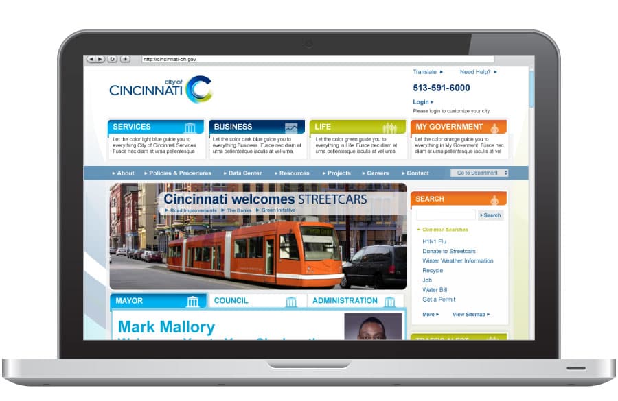
The design system used flexible patterns for navigation, landing pages, and content layouts, so departments could meet different needs without losing visual consistency.
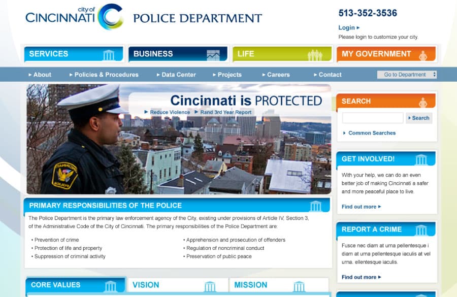
Overview and landing page templates set a clear structure for each section and guided visitors to key services and information.
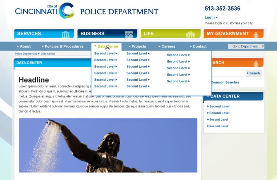
Secondary pages kept the same navigation patterns so people could move between departments and services without relearning the interface.
My role: Art Direction, Information Architecture, UI/UX
Client: City of Cincinnati
Team: Topic Design